A pixel-perfect design conversion from Figma design to WordPress.
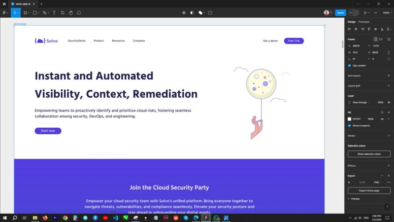
Figma Screenshot

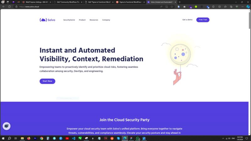
Website Screenshot

Figma - Home page full-screenshot

Website - Home page full-screenshot

The only difference is in line-height. In Figma design the line-height varying in headings. I used 1.2em (120%) in headings and 1.6em (160%) in body text for better readability.
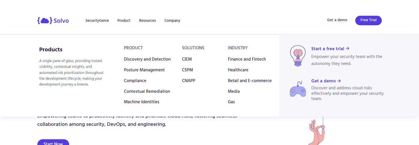
The desktop megamenu created with Elementor’s menu (megamenu) element. But the mobile menu designed in Figma was not possible by using Elementor’s menu (Mega menu element). I simply create a custom mobile menu by adding some jQuery and custom CSS code.

Plan:
Reviewed all the pages of Figma file. Global Sections: Created a list of the repetitive sections which have been placed in different pages without any change. Global Layouts: Created a list of the sections which had been similar layout, but the content is different. Headings: Created a list of all titles according to heading tags (h1 to h5). Listed down color-pallet.
Theming:
Started theme by adding global colors; set typography; create headings, buttons and form fields; set typography scale for responsiveness. Started implementation of header and footer. Completed global sections first i.e. CTA, testimonials, mega-menu etc.; and global layouts. Exported all icons and graphics to SVG; and images to webp format for quality result and good performance.
Implementation:
Started implementation of home page design according to desktop, tablet and mobile device. Created and implemented product pages design. Created and implemented other pages and posts pages design i.e. blogs, events, webinars, case studies and use cases.
Testing:
Tested all pages in actual devices i.e. tablet, iPad, android phone, iPhone etc. Submitted to client for Q.A. to check performance.
Finalize:
Completed the changes after received insights from Q.A. team and migrate the website to live.